Strange Tales
- Strange Tales 1
- Strange Tales 2
- Strange Tales 3
- Strange Tales 4
- Strange Tales 5
- Strange Tales 6
- Strange Tales 7
- Strange Tales 8
I’m going to quickly go through a comic book for you. This comic book, an issue of Strange Tales later reprinted in Captain America.

Why this one? This one is an old comic by Stan Lee and Jack Kirby, and it was probably done at a time when the page rates for artists were around ten bucks a page, fifteen bucks a page, so it was probably done very quickly. I guarantee you, Jack didn’t spend a great deal of time pondering each panel. You couldn’t do that if you wanted to earn a living. He didn’t give it a lot of thought. He did it from instinct more or less. Nonetheless, it’s a great illustration of fundamentals.
I’m not recommending that you draw like Kirby. I don’t advocate any particular style. I don’t care. But this will help you understand storytelling. This particular book, Strange Tales 114 reprinted in Captain America #216 is a very old Kirby story, therefore it’s cheaper than going out and buying the original issue. Buy a reprint copy. You should be able to find it. I’ve bought and given to artists hundreds of these.
There are a lot of reprints out now. The Marvel Masterworks, Marvel Essentials
…stuff like that. Any old Kirby story is instructive. You’ll find other people too—old Wally Wood stories, old Steve Ditko stories are very informative. But let me walk you through this one and show you examples of some of the things I just told you.
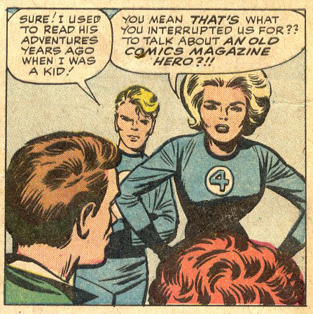
Here’s the splash page.

In order to understand the story, a reader has to know where each scene is taking place. He or she has to know who is present, everyone who’s present, at that location. So, this is our establishing shot. We understand immediately—it’s clear at a glance—that we are in the backyard of a suburban home.

You notice this little piece of air right here? That tells that you’re seeing the whole house. If you didn’t have that little space, if the house was cropped, you might think that was the wing of a mansion. But it isn’t. It’s a small house. So Kirby tells you very clearly you are in the backyard of a modest suburban home. And that tells you a lot about the people who live there.
In order to understand the story, you need to know who the characters are. What do they look like, head to toe? Are they wearing roller skates? Got to see their feet…. This overall look establishes the characters. Now we know, in general what they look like. Okay, what do we have here? We have this pretty woman in a uniform, this guy who seems to be on fire, flying, and three young men arriving in the back yard. We see all of them head to toe. They are established.
That’s everybody who’s in the scene. I absolutely guarantee you that there is not a fourth young man arriving, just off panel. Kirby shows you everybody who’s there. Because that’s important.
It is also important to introduce the characters, that is, give the reader a good look at their faces. That’s how we recognize each other, isn’t it?
Kirby manages to get a lot done in this panel. The location is clearly established. The characters, everyone involved in the scene, are established. We even get a pretty good look at their faces.
One problem you face as a comics storyteller is that you only have so many panels, something around 100 in a standard length story. In a few seconds of film, you can show a wide, establishing shot of a location, show where your characters are within that location, provide a head-to-toe shot of the characters and provide a close up, so the viewer can get a look at their faces. All that in about three seconds. That’s 1/1800 of even a short movie, a tiny fraction of one percent of the running time of the film. If you took three panels to accomplish the same thing in a comic book, that’s three percent or more of your space.
So, Kirby “telescopes” the storytelling obligations. That is, he collapses several important storytelling necessities into one panel. Brilliant. But he won’t stop there. Wait till we get to page two.
Remember, the reader has to know where we are, where in particular, and who’s there. Everyone who’s there. We have to establish the figures, introduce characters by showing their faces well, and then we choose the appropriate depth to effectively show what’s happening.
You don’t have to do that in that sequence—it’s not a drill, it’s not a thing you do by the numbers. But, somewhere in the course of every scene you must get across the location, where the characters are within that location, who’s there and you have to make sure we know they’re not on skates and we know clearly who they are.
Watch any Cameron film. Any Spielberg film. Any Lucas film. You’ll see that they do what I’m preaching here every single scene, every single time. It’s only comics guys, out of all the visual media creators, who don’t seem to grasp this. Why, I don’t know. Do it! Tell the story! Make it clear. Communicate. If you don’t communicate, if you don’t tell the story clearly and effectively, nothing else matters.

All right, we’re in the backyard of this suburban home. Three young men are arriving. Look at her, the Invisible Girl. You get a pretty good look at her. You’ll see her feet later, trust me. You get a pretty good look at her, enough so that you might actually recognize her if you saw her again. Look at the acting going on here. It’s clear that these guys are arriving and they are excited. What is she saying? Even if you can’t read the balloon, you know she’s saying, “Stay back boys,” just from her body language. Cool.
Now, look at the Human Torch. It’s pretty hard to draw “Watch out, I can’t stop!” even for Kirby. So he relied on Stan. It is a verbal and visual medium. Here is a clue: writers, let the artists tell as much of the story as they possibly can. You provide the “watch out I can’t stop” line when you absolutely have to. If the artist is properly carrying a large part of the storytelling burden you’ll have lots of room to say pithy things, things that can’t be entirely conveyed by the picture. Emotions. Sparkling dialogue. Brilliant insights. Whatever. You won’t have to waste space telling the reader what’s going on, what he or she should be able to discern from the art. There is no dorkier dialogue than, “I’ll use my power ring to make a giant boxing glove.” Have I ever written something that stupid? In the interests of full disclosure, I admit it. Yes, I did. Dorkier, even. I may even hold some world records. But give me a break, I was a kid when I started.
You remember the early issues of the Fantastic Four? On the splash page, you’d see something like the Thing holding some huge piece of equipment that obviously weighed tons. Reed Richards would be stretching, turning dials on top of the machine. Sue was always halfway invisible, practicing invisibility while doing housework, dusting or something. Johnny was always about to give the Thing a hot foot. It was all clear in the art, and so Stan could have Reed saying some ten dollar words that gave you a clue that he was the brains of the operation. Right away, you knew a great deal about the characters. Just like that.
P.S., the machine the Thing was holding up was the McGuffin, the item that provided the impetus for the story—a time machine or whatever. But here’s what I’m getting at. Stan didn’t have to explain the Thing was strong, you could see that. No need to have dorky dialogue to explain the Torch or Sue. Instead of having Reed say dorky things, he could have him saying something meaningful that advanced the tale or gave us insight into his character, like “E=mc2, I sure love Sue.”
Reed Richards’ coffee cup was always on the other side of the room. Did you ever notice that? It was never close to him. It was always on the other side of the room, and he was always stretching for that coffee cup. And it was perfectly clear in the art. So, instead of saying, “I’ll stretch across the room and reach my coffee cup,” he could say something like, “If my time transporter works, we can prevent Atlantis from sinking!” The art carried much of the burden of exposition.
There are times when you have to help your artist. He or she can’t do it all. You guys have to work together.
So, back to the Torch/Cap story, what we’ve got here so far is this: we’ve established locale, established all the figures, it’s a small enough locale so that we didn’t have to do two shots to establish locale, and we’ve even introduced the characters a bit visually. We got a pretty good look at her, a pretty good look at these guys and the Torch. Not bad. We’ve telescoped a lot of those storytelling obligations in the one panel.

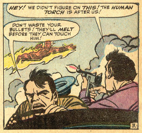
Page two…. So, here’s the Torch. He’s getting sprayed by the hose as he narrowly misses these foolish guys, who have ducked to the ground. You notice that Kirby shot this perpendicular to the vector of the main action. Why? Because it’s a complex action—the Torch flying, the water jet blasting him, the kids ducking—so complicated that if he doesn’t show it diagrammatically, you might not understand it. He was right.
Look at her, Sue. What’s she doing? She’s reacting. The action is taking place at that medium depth—remember, like most sports shows?—full figures, standard human action depth. Clear as a bell. And the reaction? Close up, standard human reaction depth. Aha! But, the panel design dictates that she has her back to us! No problem for Kirby, he carries her reaction in her expressive hand gesture. Genius.
If someone is reacting, talking on a phone, emoting, we usually need to see them up close to see their face and feelings. So, here, Kirby follows the rules. They’re not rules, actually, they’re sort of generalities that usually work. I’ll show you in a while how to violate the “rules,” how to throw them to the ground and dance upon them, on this very page. But in the case of this panel, Kirby goes with the usual techniques.
Page two.

Take a look at the second panel.

The boys have landed in a heap. In order to make that clearly, Kirby treats it like action, that is, he uses the usual action depth and shows us full figures, or nearly so.
When I say “action,” by the way, I’m referring to action in the theatrical sense. Action doesn’t always have to mean punching somebody. While I’m at it, “depth” refers to the distance from the camera, our point of view, to the featured element or elements of the panel.
Now look at panel three.
This is all reaction/interaction. It’s just people interrelating. Nobody’s jumping, or running, or even lying in a tangled heap. So what does Kirby do? Once again, he goes with the standard point of view for such things, close up, so we can see the faces well. So, there it is. Look at that body language. Is she peeved or what? You don’t have to read the balloon to know that. Every panel, every time, if it’s possible, Kirby gets across the emotions of the characters in the picture.
Take a modern comic you haven’t read, flip through it, don’t look at the words and try to guess what the characters are feeling, what they might be saying. Then read it. Then, I think you’ll appreciate Kirby’s skill even more.
Panel four.

Here you have the same situation as in panel one, action in the background and reaction/interaction in the foreground. You’ve got action back here, Sue walking away. Kirby shows that full figure, not cropped, at the depth that’s usually best for action. See the bottom of her foot? See her body position? It is absolutely clear that she’s walking away.
Up close, this is interaction, again at the prescribed depth. Look at the body language. Johnny’s expression and gesture says, “What’s up guys?” even if you don’t read the balloon. The guys look excited, don’t they? “Hey, Johnny you got to see this.”
This was inked by Dick Ayers, probably with a ten penny nail in a hurry. Like I said, you had to go fast to make a living. But it’s clear and effective, isn’t it? A lot of inkers these days getting paid big bucks noodle up the art like crazy but aren’t effective and don’t make things clear.
Panel five.

Remember I said you could violate the “rules?” Here, these guys are just talking again. If you go by the usual approach, wouldn’t you show them close up, interacting, showing faces and expressions? Well, Kirby just did a panel close up. Kirby is a good artist. He says to himself, “You know, those aren’t really rules. They’re just kind of general guidelines, and I just did a shot of these guys close up. It’s the end of the scene. Yeah, I can do that thing where you’re like pulling the camera back as your leaving the scene, “dollying out,” as they say in the movies.” That kind of thing. He says “Yeah, but I still have to show them talking. I still have to get across the sense of what they’re saying.” And, look, he did it. Look what he did. He gave them big gestures, body language that can be understood at a distance, to get across the general sense of their interaction. Look. You don’t have to read the balloons to know that the guys are saying, “Come on Johnny,” and Johnny is saying, “Gee, I don’t know.” Check it out.
There’s a scene in Rocky like this, a rule-violator. After Rocky is offered a shot at the champ, there’s a scene in which the Burgess Meredith character…Mick? comes to Rocky to ask if he can be Rocky’s manager. Mick hated Rocky for being a pug, for failing to live up to his potential, and most of all, for working as a leg-breaker for a loan shark—(though, by the way, Rocky was a failure at that because he wasn’t vicious enough). But managing a contender is Mick’s last chance for glory, so he comes to Rocky’s apartment, hat in hand. It’s the first time’s he’s ever been there. He pleads with Rocky to let him be his manager. Remember that scene?
Rocky is getting revenge for all the mistreatment he ever got from this Mick. He tells him to get lost. That scene, in the apartment, is filmed mostly close up and what Barry would call close medium—as you’d expect. Very intense, emotional stuff.
Finally, Mick gets the drift and he leaves, and shambles away, a broken man.
The next scene is shot from a distance, from across the street—a rain-soaked street. You see Mick shuffling away. You see Rocky’s door open, he comes down the stairs, he runs over to Mick, catches up with Mick, puts his arm around the guy’s shoulder, shakes his hand. All big gestures that you can understand at a distance—he relented and he’s hiring Mick as his manager. All big gestures and body language. All you hear in that scene is music. No dialogue.
I think that was basically because Stallone couldn’t possibly write dialogue good enough. That’s one. No offense to Stallone. No one could write dialogue better than what the body language expressed. Number two, he just did a scene real close up and intense, so the contrast really helped to set that scene apart, to emphasize it. There are no rules folks. There are some generalities—useful tools, storytelling standard operating procedures that we’ve learned in the century-plus of the development of visual/verbal media. Use them and also learn how to change up, how to violate those rules.
Page three.

Here’s the establish-the-big-new-location-shot, the Los Angeles Coliseum shot. Now that’s an establishing shot.

If you look carefully, you can see Johnny in the lower right hand corner. That’s Kirby ”telescoping” again, establishing our featured character’s position within the location. This really needed two shots, but remember, Kirby had fewer than 100 panels to tell this story, and he compromised here—probably hoping that Stan would mention Johnny’s presence in the caption. He didn’t. And the colorist colored Johnny’s shirt wrong. Oops.
Don’t be too hard on the colorist. This work was done at a time when colorists were getting 50 cents a page. He was in a hurry. I forgive him.

All right, so now we go right from Johnny very small to a close up. Why did Kirby do that? Why do you suppose he did that? Well first of all, Johnny’s wearing different clothes. The only shot we have at recognizing him is seeing his face. Kirby also throws in the gratuitous sex object no extra charge.
Establish the location, locate your featured character or characters within the location, establish and introduce the character…. Because this is a comic book, with limited space, telescope if necessary.

Okay, action happens. The camera comes back to that action depth, that medium shot depth. In this case the actor is a car—with two guys in it—but the theory is the same. Pull back, show full figures, that is, the entire car.

Johnny flames on. Notice the similarity between his pose in this panel and his pose in panel two. No accident. Kirby took the trouble to show him flame on. He didn’t cut right to a shot that showed him entirely aflame. Why? Because, so far, you’ve never seen Johnny flame on before. Kirby wants you to understand it.
You are communicators first. Make it clear. Introduce concepts—like flaming on, the transition between human and fiery super-hero—just as you would introduce a character.
I’ve never heard anybody complain that a comic book is too clear.
So Johnny flames on and now we see, supported by the same body pose here, that this guy is the Human Torch, and that’s what he does.
And he flies, as already established. Cool. Background, action, full figure. Foreground, reaction, up close. Kirby usually follows the general SOP.
(JayJay note: SOP = Standard Operating Procedure)
This Kirby guy knew his stuff.
Page four.

Okay, panel one we have action—full figures if you don’t count Cap’s toe.

Look at the reactions of the background characters, and the Torch, for that matter. So much is expressed so simply and so powerfully. The words underscore the attitude Captain America expresses in the picture, and the Torch’s reactions, physically and verbally, tells us that what we’re seeing is a big deal.

Panels two and three, action, full figures, all full figures, standard action depth.
Page five.

Panel one. Action, full figures.
Panel two. Action, full figures.
Panel three. Action, full figures.
Panel four. Action, full figures. Anybody noticing a pattern, here?
Panel five.
Action, full figures, and he puts the crooks who are reacting close enough to the camera that we can see their expressive faces and gestures. The Torch and Cap’s emotions, farther away, are expressed in big gestures—and unmistakeable.
Page six.

Panel one.

Action, full figures with a couple of foreground figures cropped, suggesting that more cops are arriving. No one could possibly misunderstand this panel. The bad guys are being arrested. Clear at a glance. Notice that the Torch is seen in the background. Kirby wanted us to understand that this is taking place close by where the Torch and Cap are, giving us comfort regarding the location.
Panel two.

Reactions, all close up. Standard operating procedure. And brilliantly conveyed.
Panel three.

Back to action, full figure on Cap. An expressive hand, foreground and just look at the big-gesture excitement background. Hooray!
Panel four.

Action, full figure. The Torch is flying away. Note that this is the FIRST TIME KIRBY HAS TILTED THE HORIZON! In every other shot to this point, the horizon is DEAD LEVEL. Don’t be confused by the upshots and downshots. Look for things in each panel that should be vertical. They are. Every single panel to this point is level-horizon. Trust me, or get out your drafting tools. Kirby moves the camera up, down and all around, but very seldom tilts it off level.
So why did he tilt the camera thirty degrees or so to the left here? He had a reason. The Torch is waaay up in the air, and he wanted to give the readers a little of that airplane banking feeling, a little vertigo.
DC Comics used to give new artists a copy of a page drawn by Ric Estrada, that they referred to as the “perfect page.” It had a close up, a long shot, a medium shot…. And the horizon was tilted in most, if not all of the panels, to make it “more exciting.”
Stan and I used to look through a DC comic book once in a while and laugh out loud at some of what we saw—Superman landing with one foot tucked up under his butt, a totally unnatural pose—who would do that?—a ballerina?—panels that had captions saying, “Green Lantern fires his power ring,” in which the art showed Green Lantern firing his power ring and Green Lantern had a thought balloon, “I’ll fire my power ring,” and all the horizons in every panel were tilted.
More exciting? Nah. Just made me seasick, or made me wonder if there was an earthquake going on.
But I digress….
Yes, we at Marvel screwed up too, sometimes. And, yes, I am guilty as charged. I did stupid stuff. Hey, I was young. I got better. Or less stupid. Whatever.
Am I saying you can’t tilt the horizon? Nope. I’m saying DO IT FOR A REASON. Do ANY trick shot for a reason. I recommend doing things for a reason. More on that later.
One more thought regarding tilted horizons. Do you guys go to movies? How often does Cameron tilt the horizon? Spielberg? Lucas? Anybody noteworthy? GET A CLUE! Only comics guys, among all visual storytellers, for reasons mysterious to me, except that DC preached it and required it for a long time, routinely and stupidly, meaninglessly, tilt the horizon. Feh.
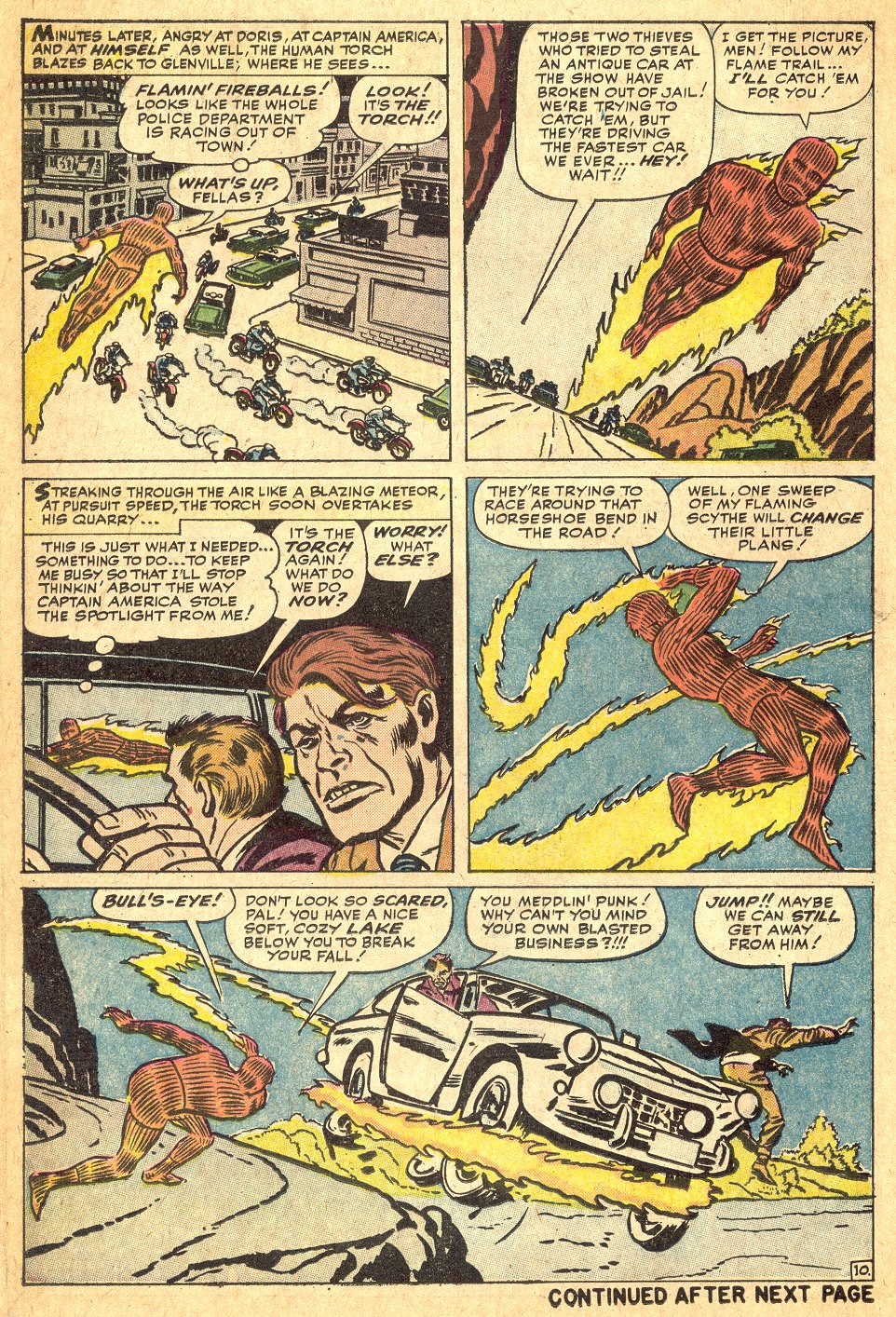
Panel 5.

Here we cut to new scene. This is one of the places where comics have a problem because ideally, you want to end a scene on the last panel of a page and start a new scene on the next page. But Kirby has only 100 panels and he had to make a compromise. He was also probably doing this fast—he probably was doing five pages a day—so he couldn’t think about it too long. This is all on instinct. That’s what’s amazing—it’s all on instinct.
So, he’s got a lot to do here. He’s got to show the Torch reacting to something, he’s got to show what he’s reacting to, a newspaper, he’s got to introduce the characters, he’s got to be close enough so we can get a look at the new character, the Torch’s girlfriend, Doris. But he’s got to be far enough away so we can see the bit of business she’s doing—serving sodas—and he’s got to establish the new location.
He does it. The guy’s a genius. He’s amazing.
Page Eight.

Panel one.

Action, a full figure.
Panel two.

Here’s the first time in the book where Kirby does not open with the establishing shot. He opens with a close up. This is a cinematic technique called “pull back to reveal.” He starts off real close. He still gives you little hints and details that tell you you’re on a rooftop. But look at this. With half the guy’s head and part of his hand you know he’s skulking on a rooftop.
Panel three.

Kirby pulls back to reveal that Cap’s way up here, above the city. Crossing a wire.
When little Jimmy read this in a barber’s chair back when I was 11 years old I said, “Wow, cool! He’s going to fall!”
Panel four.

No he’s not, he’s going to jump! Whoa!
I remembered those two panels, even after not having seen them for decades. I used to tell people, artists, writers, about those two panels. I used to tell people, “You know there’s this Kirby book and there are these two cool panels.” Marvel Comics reprinted this story in 1977. We reprinted it and I said, “Yeah, here it is!”
Now wait a minute, last page I said, “Hey, Kirby didn’t want to repeat the same thing so he changed up.” Well, look at this. Here are two panels with two silhouette figures the same size in panels side by side.
Joe Orlando at DC Comics would probably have flapped his arms, screamed and pulled all his hair out. He doesn’t have that much anyway. Two similar panels side by side?! It’s not like the Ric Estrada page! But EVERY page MUST be like the Ric Estrada page! Has to be that way. Two similar panels would be “bad page design.”
Nonsense. We’re telling a story. Here’s the point. Kirby wouldn’t ordinarily do two panels of similar depth side by side, but THIS, panel three, was the best panel he could think of for a man crossing a tightrope, and THIS, panel four, was the best panel he could think of for a man jumping off, and that’s the priority—telling the story.
“Page design” is priority #14, or #36, or whatever you want, but #1 is telling the story. Don’t let ANYTHING compromise the story. Like I told you, there are guys who get away with it, putting other things before storytelling.
I can hear you thinking, “Hey I know of a guy who makes a million bucks a year who doesn’t tell a story.” Fine. No one can teach you that, being glitzy enough so that people buy your stuff even though it’s vapid. Glitzy and glamorous, a series of pin-up shots that convey little, the flavor of the month succeeds once in a while. That’s luck. That’s a fad.
Do what I’m telling you and learn to draw, and you will always have work. For at least forty thousand years, good storytellers have made a living.
Panel five.

Action happens, full figure on Cap. This is interesting. The action takes place outside the jail cell, but he’s got to show these guys, the criminals, close enough up so we can recognize them as the robbers and see them react. He gets it done.
Page nine.

Panel one.

Now they’re talking. Interacting. As you’d expect, Kirby shows them up close.
Panel two.
Here’s an interesting thing. They’re still talking. Generally, you’d show that up close. Kirby could have done this closer, but he pulled the camera back here to show you how high up we are, where we are. Resetting the location. An establishing shot. Why’d he do that?

Because he was trying to set up this shot. Remember I said he was very careful about tilting his camera? He has now tilted it 90 degrees. He’s turned the world on its side. When little 11-year-old Jimmy read this in a barber shop, I never for a moment wondered why these three men were lying on the street. [laughter] I knew exactly what was going on. Why? Because he set it up. He made sure I could not misunderstand.
No panel you can do is wrong, it depends on what’s around it. Anything you can think of, you can do. There are no rules. Anything you can think of, you can do it. There’s no such thing as a bad panel. It depends upon what’s around it. Set it up, make it clear and you can do anything.
Panels four and five.

So Cap puts the crooks in a car. A Ferrari, says Stan. I’m guessing here that Kirby didn’t have any Ferrari reference handy. And they get away. What’s interesting here is the pacing. More about that in a minute.
Page ten.
Action, full figures, reaction/interaction up close. See? One tilted horizon, a flying shot. Okay.
Page eleven.

Action, full figures, standard action depth. Reactions and emotions up close.
Page twelve.

Panel one.

This is an interesting panel. Look at this. There are 15 minutes of time in this panel. Cap obviously broke in, overpowered the guard, looted the vault…. Kirby didn’t spend his life drawing this panel, but, everybody knows what happened here. We see him wheeling the money away…
Panels two through five – this is the setup for a long pull-back-to-reveal. Wait till you see what’s next.
Page twelve.
Okay, this is an extended pull-back-to-reveal sequence.
We see Cap using a remote control device. What is he up to? No clue yet. A skyhook-thingie pulls him up. Again, a little vertigo in this shot. You know these buildings are planted on the ground, by now you’re pretty sure that way is up, so no confusion here.
Cap gets pulled into…something. We can’t see it. Boy I wish I could see it. What is it? Kirby isn’t showing us yet. He’s setting us up for the big surprise.
The Torch sees it, whatever it is. He looks impressed. Man I cannot wait to see this thing!
Turn the page.

OH, MY GOD, IT’S A FLYING HELICOPTER ROCKET LAUNCHER PLATFORM! [laughter]

Now is a good time to mention that I do not recommend this story. I recommend the STORYTELLING. Think about it, if Cap can afford a flying helicopter rocket launcher platform, why does he need to rob the bank? Maybe it’s to make the payments? I don’t know. Unbelievable.

Here is the first time in the book that action takes place where the figure is cropped. Why? Because the main action is the big rocket, the booster, blowing up and the little rocket, the capsule, taking off, and that’s shown at action depth.
By this time Kirby is pretty sure that we understand that they’re high in the air. We understand that the Torch is flying. So, Kirby uses him as a design object, foreground. This is the main action, booster exploding, capsule taking off. That he shows “full figure.”

Action. Back to full figures.
Panel four.

Action, full figures.
Page fourteen.
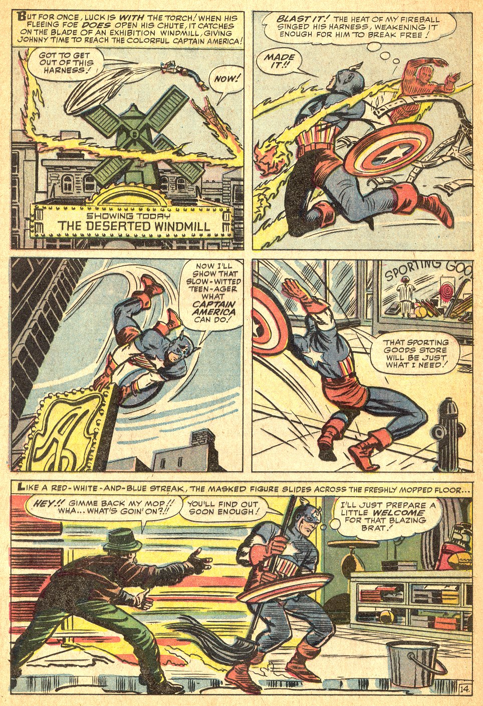
Look at panel one. Ask an artist to draw that scene today and he or she will give you a double page spread and still crop the windmill.

Okay, action, full figures, action, full figures, action, full figures. Like a Cameron film. Like Raiders of the Lost Ark. Like almost any good cinematographer’s film. Check it out. Watch T2 with the clicker in your hand. Pause a lot and think “Why did he show that the way he did?” Movie people know what to do. Comics people? Well…Kirby did.

This last panel…. I had an argument with Barry Windsor-Smith…I actually won a bet with him on this one. At his request, I used to do panel-by-panel plots for Barry when I worked with him at VALIANT, with a pretty detailed description of what was in every panel. Once he came in and said, referring to a certain panel, “This can’t be drawn.” I said, “Why not?” He says, “This action takes at least four panels.” I said, “Barry what if I told you I want you to draw a guy who is sliding across a wet floor, snatching the mop out of another guy’s hands as he sails by him, and at the same time, establish the location, a sporting goods store.” “Can’t be done. Three panels at least.” So I got my Captain America book out, pointed to this panel and said, “How about that?” That really annoyed him. [laughter]
Actually Barry’s not wrong. He just has a different approach. When we get to the subject of pacing I’ll explain to the different approaches. They’re all legitimate. Kirby’s approach was this way, “Kirby pacing,” and that tends to be more like mine. No, mine is like his. Sorry. Make the biggest jump you can between panels, especially in action sequences, for which the readers can still imagine the “in-betweens.” Barry’s style, I think, tends to be more European, though Barry is so good he can do anything. Most European comics artists tend to play things out more deliberately. Japanese comics creators tend to do one and only one action in each panel. Different strokes….
Page fifteen.

Look at panel three.

Here’s another one of those trick shots. It’s action, but Kirby crops Cap. It’s a looking-down-the-bow shot, cropping one of the figures in action, a trick shot in my opinion. But it works. Why? Because he set it up, just as he set up the turn-the-world-on-its-side shot a few pages back. Set it up, make it clear, make whatever’s going on unmistakeable and you can do anything. Kirby sets it up.
Let’s say panel two wasn’t there. Let’s say we put the archery kit on the floor in panel one and went directly from panel one to panel three. First of all you can count on the color separators to get the pants colored wrong, which doesn’t help. Second there’d be some people who’d say, “Well what happened?” With this shot there, panel two, they cannot fail to understand this extremely dramatic angle, what’s going on, in panel three.
Isn’t that cool?
Okay, more of the same. Great stuff. Look at those expressions. Look at that body language. Trust me, the good guy wins.


That’s a crash course in storytelling my friends. What am I getting at here? Drawing like Kirby? No, not at all. I’m advocating keeping your priorities right. You’re here to tell a story.
If you’re doing fine art, then it’s between you and your muse and no one can criticize you because no one knows what the muse whispered in your ear. You’re satisfying some instinct in your soul. Maybe people will like it, maybe they won’t, but you’re the only one who knows what it’s supposed to be.
But if you’re doing commercial art you have an AUDIENCE. Commercial art has a GOAL. And therefore, there is a standard by which it can be judged. Did you reach the goal?
Your audience might be all of you people right here. It might be the Pope, if you’re Michaelangelo, for instance. It might be an editor you’re trying to please so he or she will pay you. Who knows? But you have an audience and that audience has a desire, they have a goal, in the case of our audience, to be entertained. They want a story. Tell them the story!
If you’re selling stuff to us, DEFIANT, or most comic book companies, the goal is to tell the story. Unless the editor is brain-dead, that’s the goal, that’s how your work will be evaluated, assuming you write or draw at a professional level. Gotta do that. Anything that contributes to telling the story is good, anything that detracts from it is bad. That’s the yardstick. That’s how you can evaluate your own work. Think about it. Is this helping? Is this hurting? What?
I remember the day young Frank Miller came into my office at Marvel and said, “I get it. We’re telling the story. We know the story and they don’t, so we’re telling them the story!” Yep. Then he stopped being a beginner and quickly became great. Now, he’s a genius zillionaire. Let me tell you a few other little things here that may help you along the way, pencilers and writers. First of all let me tell you quickly about pacing. You understand there are two different ways to do comics that are prevalent these days. There’s what they call Marvel style and the DC style, although nowadays both companies do things both ways.
Marvel style, you do a plot first. A plot is a brief—usually brief—description of what the story’s about, writers. Could be a single page, could be like Claremont’s plots, as thick as the Manhattan telephone book. That is handed to the artist. Then, the artist tells the story in pictures. He or she doesn’t know what the dialogue is going to be, exactly, unless the writer included some dialogue in the plot. So, it’s sort of a silent movie. Okay, it’s still pictures, so it’s sort of a silent slide show.
The artist might write little notes in the border to suggest dialogue actually. Good ones do. So, the artist draws the story, then the pages are sent back to the writer who writes dialogue to go with the pictures. He or she places the balloons—that is, indicates where he or she thinks they should go, usually with a blue pencil, on the original art or on Xeroxes. Then, assuming that the editor approves all of the above, the whole thing goes off to be lettered and inked. Okay, that’s the Marvel method. Good news/bad news. If you have two guys who work together really well, like Stan and Jack, who really know each other pretty well, it works very well because it lets the artist do more of the visual thinking and that’s basically what he’s good at, and lets the writer react to the pencils when he’s creating the dialogue so if he sees a little gesture or expression, it might inspire something. That’s the Marvel style. That’s the most prevalent style, so if you’re going to be a penciler you’re going to encounter that. If you encounter that, you are the cinematographer. It’s up to you to pace the story.
The other way is full script. It’s sort of like what I did for Barry. You, the writer, basically tell the artist panel-by-panel what to draw. In my full scripts these days, I describe what is to be drawn in detail, write all the captions and dialogue and provide all the reference. Because I’m obsessive/compulsive, I guess. Because I want it just so. Never quite get it just so, but hope springs eternal….
In that case, artists, you are just drawing. You’re just executing what you’ve been instructed to do. You might have some latitude, but you’re basically executing. Bring your “A” game, execute well.
So, writers—and artists working Marvel style—let’s talk pacing for a minute. What do I mean by pacing? I said you have about 100 panels in a comic book to get across the story. How do you know how much to put in a panel?
Need a little history here. Back when I was a kid most comics, most DC comics were done by what I would call extremely fast pacing. Every panel was a scene. I remember old Legion of Super-Heroes comics with every panel starting with a caption. “Soon, at Legion headquarters–a fateful meeting!” You’d have the Legionnaires sitting around a table one would say, “We must pursue the space pirate.” Next panel, the art showed a Legion space ship chasing the pirate ship. The caption read: “Later in deepest space…” Dialogue coming from the Legionnaires’ space ship: “There’s Roxxas, the space pirate!” Next panel, in which the pirate ship was damaged, another caption: “After a massive battle…” “We got him!” Every panel was a scene! And they were able to do a lot of story in very short space. At that rate, you could do War and Peace in 24 pages. But it was kind of dull, kind of dry.
It doesn’t mean that that kind of pacing is useless. It does have its uses and I’ll tell you later.
When Marvel came along in the early ’60s one of the big revolutions was slower pacing. Don’t get me wrong, it was fast and exciting, but every panel wasn’t the whole scene. The action was fast and furious, but played out, not described in captions. Usually. They went to what I call “Kirby pacing,”—basically going from significant action to the next significant action, or reaction, or both, making the biggest logical leap possible. Remember my famous tightrope scene here. It’s a pull back to reveal but notice that he doesn’t pull back to reveal Cap on the roof, then show him get on the tightrope, then show him cross. Kirby takes the biggest logical jump he can possibly take. So you still have the sense that things are moving fast, but you get a lot of info, dense content.
When the scene wasn’t action—let’s say it was a conversation, or a romantic scene—Kirby, Ditko and other Marvel creators might slow the pacing down. Play it out. Drive the emotions home. I worked for DC Comics in the mid ’60s. The editors there used to howl at this stuff, Marvel Comics. They’d sit there and say, “Look at this. They got two pages of the guy talking to his aunt! Oh, my God the kids are going to be bored to tears!” I’m thinking, “First of all, we’re not all kids, second, no we’re not. No we’re not.” I didn’t say anything because I wanted to keep the job. My family needed the money.
But, anyway, they didn’t get it. That’s just it.
So the pacing thing, this is a revolutionary development. Think about pacing. Make your pacing choices consciously.
Some people are inclined to show every detail of every action. That’s why we have these stories that take many issues and they’re still not done. “Decompressed” storytelling, they call it. Feh.
I wrote an Avengers story way back a zillion years ago and I did my favorite kind of pacing, which is this Lee/Kirby pacing. In the course of the story a character got injured. He was in the hospital. I did the old DC pacing to get over his recovery. Lickety-split, one caption later, explaining that a month had passed, he was out of the hospital and back. Who wants to see the guy convalescing? Unless there’s some dramatic consequence to that.
You know, I got letters. “We thought he’d be in the hospital for at least eight months. What happened?’ People were so used to everything being dragged out…. Nobody complained, however. They liked it. Hey, Mikey!
I recommend that you understand pacing. Look for it. Plan it in your own work. Think, before you write or draw a scene, “Is this essential? Do I need this panel? Do we need this panel here or would it be better if we jump to the next significant action?”
Or, if this is this a time where you want to have a romantic conversation, you want to do every nuance of it—every little detail of it, slow the pacing down. Be conscious of pacing.
Skip the convalescence.